ToyotaFinancialServices.com secure site + Toyota Financial Services (TFS) Mobile Site + Apps
ROLE
Contract UX Lead
Proposed and completed UX Strategy working collaboratively with team leads, and completed design from concept to completion. Directed VisD/Dev contractors in completing other designs.
THE CHALLENGE
Create a vision for the new customer secure site to be redesigned in phases, iteratively over the next year in support TFS’s goals to:
Significantly reduce inaccurate payoffs
Increase the use of auto-pay
Increase overall retention
Improve customer’s understanding of the overall payoff process
Reduce inaccurate Pay-offs to reduce lost
Distinguish TFS from competitors
Increase overall customer satisfaction
THE APPROACH
Establish a User Experience Strategy to create a unified vision of what needs to be built to satisfy both users and business goals while ensuring the work of the multiple teams over the next year is cohesiveness.
Since User Experience is fairly new to the team, I knew empowering the team with an understanding of not only the strategy and direction was a consideration, but they also needed to understand the methodology’s intent and approach. I worked collaboratively with cross-team members at every point to ensure the teams’ leadership understood and agreed to the findings and conclusions that would inform the strategy and direction.
Understanding the business
I reviewed and formalized business goals with the business and technical leads for this effort, probed for latent issues, and success measurements. The Business Lead did the analysis to inform the success measurements. We then worked together to define measurable success criteria.
The Industry Perspective
Working with the Business Lead, we reviewed current business process to understand pain points for customers and TFS, and opportunities to improve performance and reduce issues.
I also conducted a competitive analysis to determine how TFS can be distinguished from competitors, and identify what is a baseline experience. Members of the participating teams sent me sanitized screenshots from their banks and lenders that had experiences they liked or disliked along with their critique.

A competitive analysis showed that all of the competitors’ experiences were lacking making it easy to distinguish TFS from the competitors with usability!
Understanding the Users
I harnessed my knowledge from previous User Research to expedite the process and compensate for no time or budget for user research.
I also conducted meta-analysis of TFS and TMS’s previous customer research to anchor this effort to other teams’ efforts.
I used working sessions with marketing and business team members who had been exposed to previous consumer research to define User Profiles, Task Flows, Review Business Processes (pulled from previous User Research in Purchasing) to facilitate a strong understanding of the artifacts and foster ownership and buy-in. I peppered in heuristics of technical savviness and knowledge. We established User Profiles building on their marketing segments.
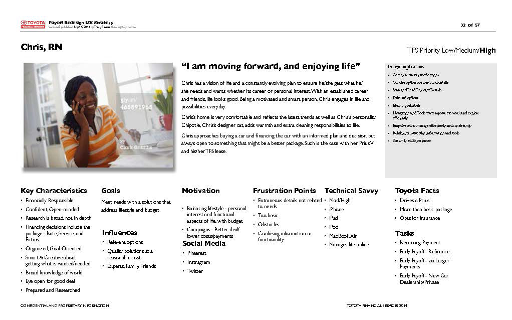

I created User Task Flows from analysis of web analytics, TMS consumer research, and also the heuristics of the purchase decision-making mental model to demonstrate how the tasks performed on the site fit into a larger task, and reveal opportunities to improve the usability of the site, while exposing opportunities to realize business goals.
Evaluating the Current Experience
I conducted a heuristic evaluation of secure site using User Tasks and Personas as well as patterns I identified in analytics in a cognitive walk-through to explain current trouble spots.
To ensure a cohesive brand experience and reduce any distraction for users due to inconsistent Visual Design and IxD patterns, I conducted a gap analysis of the public site’s design system for use with the secure site to identify which design patterns could be implemented, and secured the style guide to inform new design patterns. This ensured a cohesive experience from the referring page, new site design, and branding.
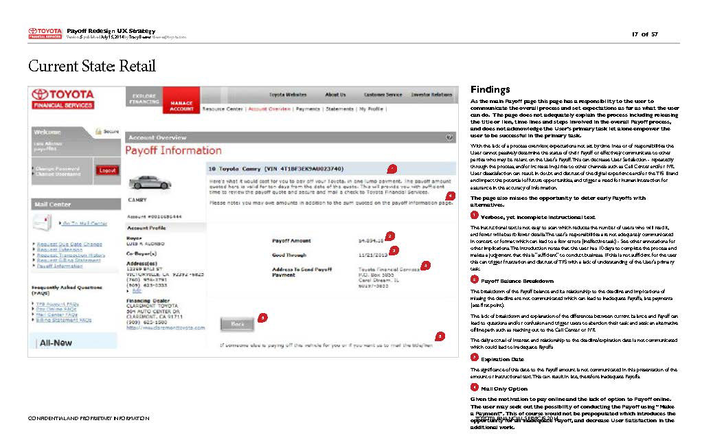
A heuristic evaluation revealed critical usability issues, and explained the user complaints and low performance of the secure site.
Defining the Solution
A Participatory Design Sessions with a cross-discipline group provided an opportunity for everyone to express their ideas at a point where they could be fully considered and inform the strategy and design.
I then rated participatory design ideas against business goals with the business lead, rated ideas against user requirements, and the technical team evaluated the ideas for level of effort. I facilitated a review of the session and analysis results to ensure a deep understanding for both me and the team harnessing their expertise and my User Experience expertise to form a unified, informed conclusion.
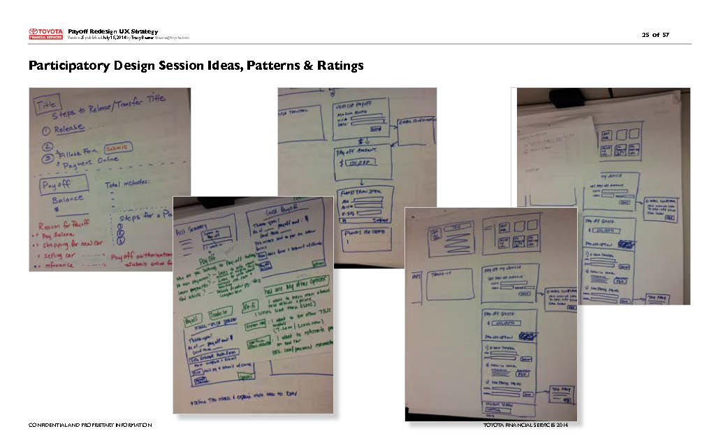
A participatory design session was conducted to harness the expertise of the team while giving them an opportunity to express their ideas at a point when they can be objectively considered and incorporated proactively.

The ideas expressed in the participatory design sessions were captured and measured against user requirements/needs, business goals and were evaluated by the technical team to determine feasibility and size of effort.
THE RESULT
I worked with the team for 3 months in crafting a strategy and a detailed design of the first feature to be designed.
The User Experience Strategy provided a unified vision on what needs to be built and how it will be used to empower the team to work cohesively in designing holistic User Experience that will satisfy both users and business goals.
By establishing the UX Direction within the strategy the cross-department teams are empowered to work cohesively for the next year, and ensure improvements in user satisfaction, and establish foundation for expanding services, reduce inaccurate/loss and confusion with the Payoff experience, proactively gather insights into motivations to Pay-off early, and increase auto-pay subscription.
I defined and directed Visual Design to ensure appropriate transfer and evolution of interface elements from the latest public site redesign to ensure a cohesive experience.
The UX Strategy depicted a new user experience and direction for Visual and Interaction Design. Conceptual mock-ups with annotations including user needs and applicable heuristics to empower the team to make cohesive decisions when compromises needed to be made.
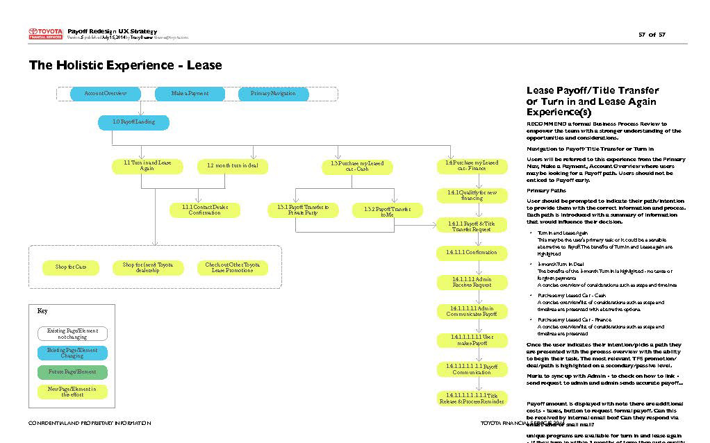
The new site architecture was captured depicting new pages, existing pages requiring change, and existing pages that do not require change to give a view of the flow and also scope of work. The annotations are directional, not perspective, to communicate what each screen needs to support – user needs and applicable heuristics.
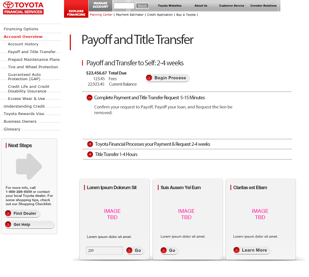
Conceptual Mock-Ups were used to communicate direction and move towards a more detailed design that aligned with the latest redesign of the .Com and the technical considerations. Here TFS pain points and customer confusion is addressed with a clear outline of the process including timeframes..
DELIVERABLES
User Experience Strategy
Annotated Wireframes for Desktop, Mobile app and sites
User Task Flows
User Profiles
Page Type Templates